Title Design Blog

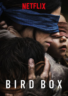
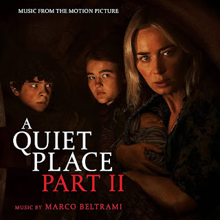
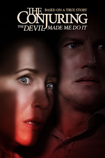
Planning the title sequence for my film's introduction has been a crucial element for the final project. My partners and I are considering using a messy and scary font to present the titles of the film. They'll blend in with the preceding title and fade away with the last. According to the shot of the scene, each title will float in the bottom-middle of the screen. This film's working title is Victim Nine, although it's subject to change. The title will be written in a font titled, "Matura MT Script Capitals" that is considerably more bold and sharp than the remainder of the text, similar to this. In addition, the primary title will be displayed in a much larger font than the other titles. This title will appear for around 4-6 seconds. Before the title of the film gets presented, all titles before that will appear on the bottom-middle of the screen, using the "Segoe Script" font from roughly 2-5 seconds. Since my film is being scripted and shot i...


